UX Writing for Reso
Onboarding copy for Reso, a concept goal-tracking app

OVERVIEW
CONCEPT
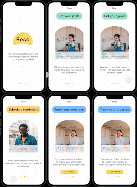
An onboarding page for Reso, a goal-tracking app for personal wellness, career, and more. Where users are given general information on what they are about to sign up for.
USER PAIN-POINT
"Overwhelmed, confused, overstimulated"
Have you ever downloaded an app that appealed to you initially, but the user flow went from download -> sign up -> full range of the product? When apps opt out of having informational onboarding, this creates a less-than-ideal user experience.
HYPOTHESIS
Creating an onboarding page will allow users to get a general idea of what the app has to offer and to slowly ease them into the process of using Reso, as well as promoting user retention.
THE GOAL
Keep onboarding frames to around 3 to 4, using concise language to convey the main functions of the app and promote user-retention.
Onboarding pages should be concise, not extensively long, and have accessible language for users of different English language abilities.
DURATION
~4 hours (copy + UI + rewrite)
DESIGN PROCESS
INFORMATION ARCHITECTURE
I first began the process by creating the IA by mapping out the main user journey of Reso.
.png)
Using the user journey map, I determined which concepts were the most important to convey to the user (Setting goals, scheduling notifications, tracking progress), which would be articulated within the onboarding pages. These pages should not only provide details into what features Reso has, but also be organized in a way that reflects the user journey in chronological order.

CREATING RESO'S VOICE
Before writing, I designed a voice chart to outline the key themes that would be communicated through Reso’s voice. The themes laid out were Helpfulness, Motivation, and Straightforwardness. I used this voice chart as reference for each iteration to ensure the brand voice was consistent.
.png)
ITERATION #1: LOFI WIREFRAMES WITH DRAFTED COPY
.png)
I intentionally designed the headings to be "actionable" steps for the user when using Reso and the body copy serves as supporting details.
In onboarding pages, the priority is to not only inform, but to also retain users to encourage them to continue on with signing up and using the product. With that in mind, the rewrite of the body copy would continue to support the headings, but instead of conveying how the user will use Reso, the goal would be to convey how Reso would be of benefit to the user.
ITERATION #2: CLEAR COPY + UI
.png)
Heavily revised from the original draft, I rewrote the body copy with the intention to convey what functions Reso has that would be beneficial to the user. There is a balance of UX writing and copy writing in the body copy that gives user’s useful information about the functions of the product but also promoting user retention as leeway into continuing to sign up.
CTA revised from "Start now" to "Get started". With a slight change in tone, the new copy feels more inviting and less demanding to the user.
ITERATION #3: CONCISE
.png)
My goal for the final iteration is to make a more concise copy. In the voice chart, "helpfulness" was a principle that was to be conveyed with phrases like "Reso will...", but there is a repetitiveness to it. In this iteration, the copy is altered to show all the things Reso is— a goal setter, an accountability partner, and a progress tracker, supported by a short description that shows how that aspect benefits the user. This iteration is less “wordy” and a bit more direct.
CTA button was also changed from “Get started” to “Start setting goals”, to be more specific and direct about the action.
MOTION AND UI DETAILS

Though UX writing was the focal point for this project, I felt providing supplemental UI details would be helpful to envision the copy within the product. Supporting visuals, color choices, and progress bars were thought out UX decisions to enhance the design.
A fun UI element that I challenged myself with was to create labels for the headings that resembled mini sticky-notes, which is fitting with the "to-do" concept of a goal-tracking app. Not entirely visually up to par, but I'm excited to practice more designing.
.png)
FINAL UX WRITER NOTES
The creation of Reso was solely for the purpose of showing onboarding copy, but in each step of the process it developed into something more. I not only got the chance to practice UX writing, but there was an element of branding, UI, and heavy strategy.
Every iteration became more of a challenge than the previous one and more thought and strategy was put in to create the final copy. To convey a specific message but to be concise was hard, but rewarding in the end. Using the voice chart as reference helped keep the content goals in check.
